
- 01/30/2006 (1:17:19 pm)
- Pat
Pat is back with his reviews of Classic Superstars 9!
These are my first reviews in a very long time. I know not everyone will like or agree with my reviews, I just wish they are at least read in full. I wanted to do them again to try and give you the best I have to offer at least one last time and what I feel are my honest opinions. I stand by my claims in the past that I feel nobody reviews like I do. I had a lot of fun doing these and spent a good amount of time and I hope everyone at least is entertained for a moment or two, even if they don't agree.I don't know when or if I will be back doing this so...
Thanks for reading in the past and present and thank you for giving me a chance to be able to do this. I do this because of you guys reading and commenting, that is why I have even been able to do this in the first place.
CLICK HERE TO PURCHASE CLASSIC SUPERSTARS 9, IN STOCK NOW AT RINGSIDE COLLECTIBLES!
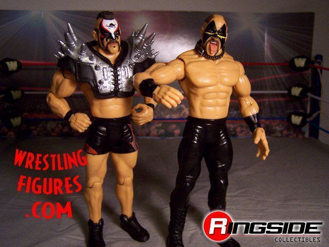
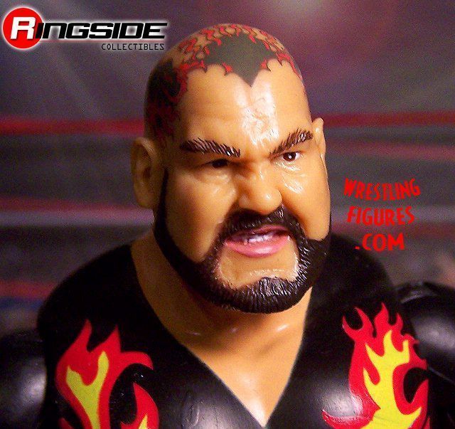
Hawk
This is modeled after a very older look and now that I have seen it in figure form I have grown to love this look just as much as my personal true classic CSTT1 attires. The scan is the same as that series and it is amazing how well Jakks was able to replicate Hawk. If they are going to continue to release LOD figures sooner or later I would enjoy seeing a Hawk with a more straight face furious look. Almost as if he just finished a high impact threat in one of their old interviews where Animal would stand at his side mildly bouncing his upper body with a slight pucker on his face of cockiness. Both wrestlers with head scans like that would be a nice thing to see if Jakks would like to keep releasing LOD. I am in no way complaining, just a suggestion that might be helpful when avoiding repetitiveness.
The tights are just straight black and so are his boots. It's a really cool look that is complimented well by his face paint. One would think that straight black pants and boots would be boring but the face paint really brings the look all together.
While this was mostly a scattered opinion rant, I must say the figure is flawless to the best of my knowledge except a slight tan might have helped. I think both LOD figures are worth the pickup for any collector. I'd rank their figures in this order so far:
1. CSTT1 Hawk and Animal
2. This CS9 Hawk
3. CS6 LOD
4. This CS9 Animal
I have been more than happy with every LOD figure released so far except for the latest Animal....
My rating for Hawk:
9.9/10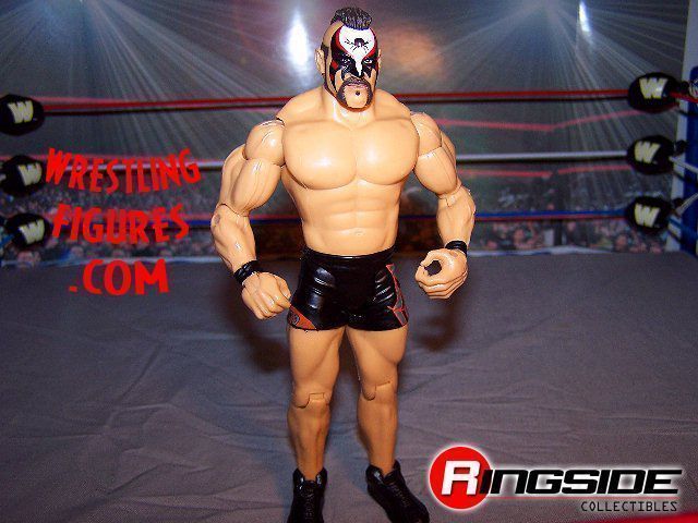
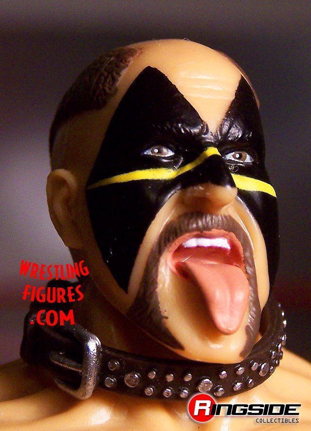
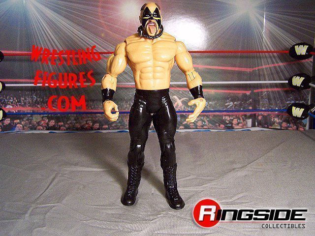
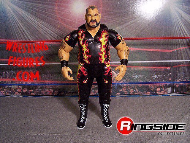
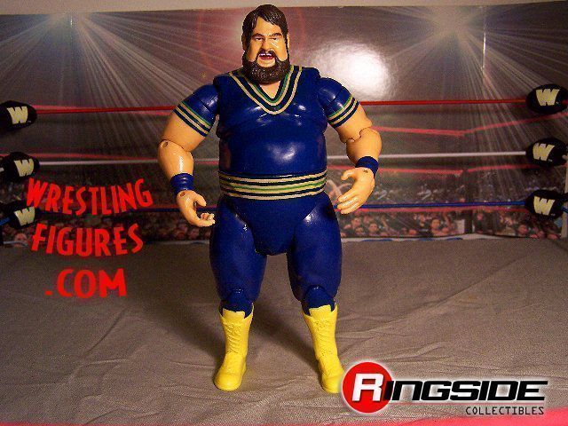
Animal
First thing I will get out of the way is the fact that he has no kneepads after the prototype displayed him with kneepads and one painted with a design to match his trunks. These figures retail for over 10 dollars in the LEAST. This is the Collectors Series. Why are there missing details on any of these immortal figures?
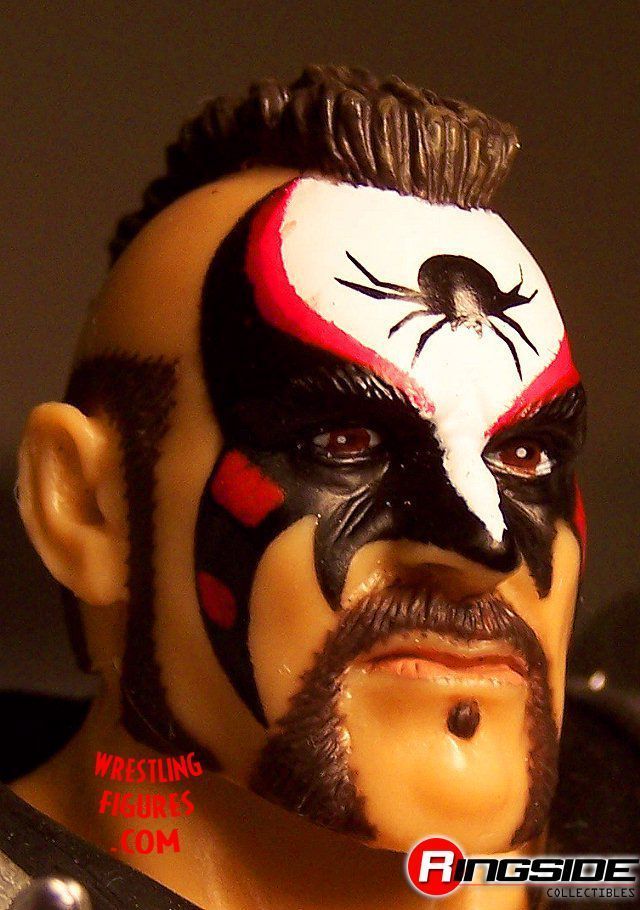
The face paint seems to be wider and covers more area than any of his last. I'm not really sure how I feel about it compared to CSTT1 but that obviously should tell you I love both. The detail this time is outstanding, very crisp on the spider and the very small stripes and extra slashes are beautiful.
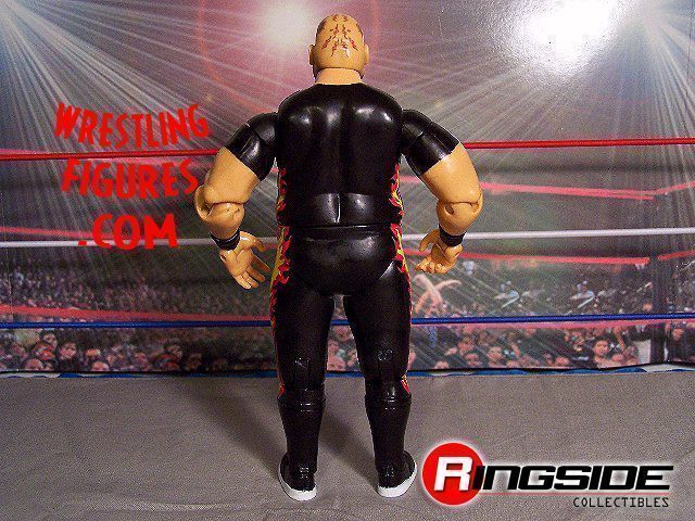
He still has his pony tail, I've heard his latest updated figure of his 2005-2006 look does not. The pony tail has never really gone well with the shoulder pads. It causes them to not rest down on his body like Hawk's do from other series. The best and most common remedy is to just leave it tucked under the pads. I used to try and manipulate it to hang over them but it never works right and you can risk breaking it off.
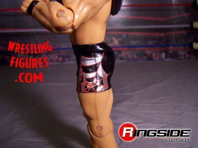
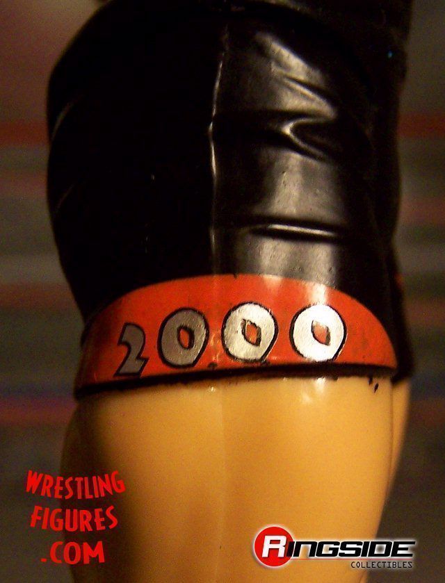
The tight design has some nice work on the spider's web, very pleasing to the eye. The other side has "2000" depicted, I didn't know LOD 2000 was classic but I will take ANY LOD figure they make honestly. I think after the prices we've seen LOD CSTT1 go for on auction sites it's safe to say they might be the biggest classic debuts ever next to others like Bret Hart (release more please), Ultimate Warrior (hold off for a few series) and Hulk Hogan to name a few.
I am not digging the legs on this figure. The sneakers just seem really wierd on him and they are not painted like the prototype. I can't really say much except that the legs look too young and at this point I think LOD was a bit older. This is all assumption but I would imagine Animal had at least slight leg hair? I don't think that guy was shaving his legs. I could be wring That might have helped, some very small painted on hairs that were not drastic at all or at least just some sort of texture to look like anything but women's skin on male features.
I think the number one reason though why the legs might look a little off...
Animal was always pretty tan and this figure is just a generic tone. I have been really waiting for Jakks to add another level of personality to the WWE figures by trying to give each person as close to their skin tone as possible. I know it would get tricky and involve a lot of trial and error but for some guys it's just gotta happen. I can't even imagine how hard it would be to get a natural looking tan on a guy like Kurt Angle or Shawn Michaels out of a plastic mold.
Animal came with some very metallic silver spiked shoulder pads, much better than the blue in my opinion.
My rating for Animal:
7.5/10 I am brutal on figures with missing details that are blatantly obvious or shown in prototype pictures.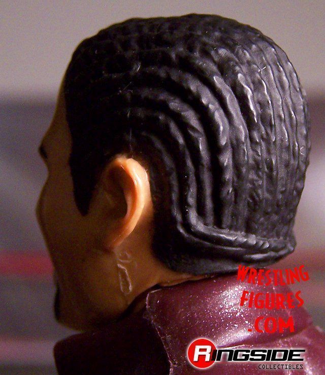
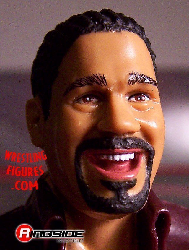
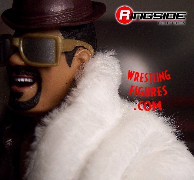
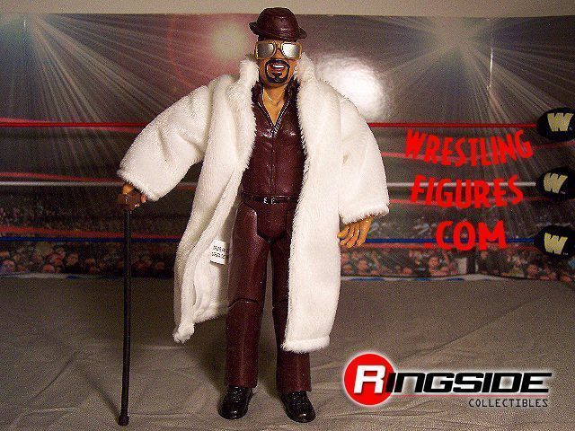
The Godfather
This is not what I was expecting. Sure, the coat is a very nice touch, the soft texture and real appearance of a pimped out coat. But why have the Godfather wearing something under it that looks like he's ready to sell a used car? The attire overall is not even close to something he would wear. As you can see from the pics his head is really horrid on that torso. The long sleeves are just very off for this guy. I think it would have at least been better to give him a colorful designed shirt with a pattern, that might have saved this flaw a little. But the Godfather without tatoos? I just can't see it and that's why I just can't agree with this.
Jakks just needs to take this pants mold and put it in their bag of tricks in the closet that they only break out when they paint and design kneepad themes. It makes people way too tall and I've only seen it work for Batista and few others of his height.
Please, give us exclusive molds like other toy lines are doing, for less retail price. That gripe might not go over well with a lot of people but it's a reality me and a lot of others are getting tired of. It is the number one reason why I become distant with WWE figures at times. This Classic Superstars idea is the greatest "gimmick" for toys I have ever seen, it's appealing to so many people. Please, go all out... our wallets do.
God Father's cane may be reused but it's still a nice touch. The Glasses are pretty weak. I think they are too bulky and they are very fake looking. Real clear tinted plastic lenses would be very nice. They don't even have to be thicker than a piece of paper, the people who appreciate them take care of them just like they do with Bret Hart's sunglasses.
The headscan is a great one. It reminds me of his Good Father days because of the cornrows style but obviously the look of joy does not. I wish there was a more swirled out braid style going on with parts of his skin showing, that would have been some serious detail. The mouth is open and it brings one thought to mind: where is his cigar? Yes, I know, this is a line for children as well. Not possible, just like his "Roll up a... for this pimp daddy" on the back of what should have been his real silk vest over a singlet tanktop.
The hat is bad, real bad. It's Johnny Stamboli's old had from early AD series. It doesn't fit this head AT ALL.
The figure is a comical one at best, a nice one to get a moment of amusement but doesn't have much lasting appeal for me. I don't think of the Godfather as worthy of this Classic Superstar line at all. If he gets in, does that mean Goldust gets in? Or Repo Man? It brings you down a debateable line that will bring up some worthy names, especially in my opinion Repo Man. But I am all for variety as long as the set is glorious overall.
My rating for The GodFather:
6.5/10 This figure is hidden behind a very nice coat, you take that away and it's a lazy attempt at an already questionable Classic worth wrestler. The hat is worthless in my opinion, no color at all either. The glasses are sorry. The attire was discussed, just flat out no detail and recycled parts. The hair is not detailed for what it should and could have been.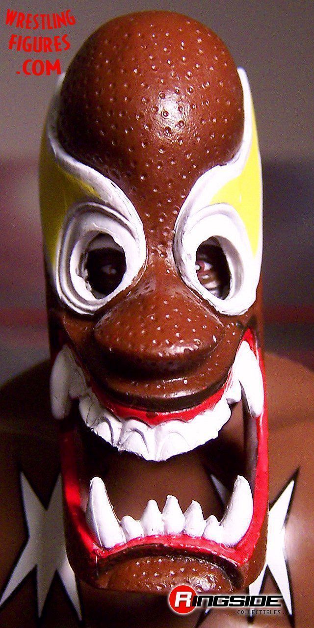
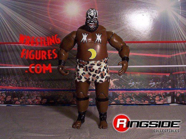
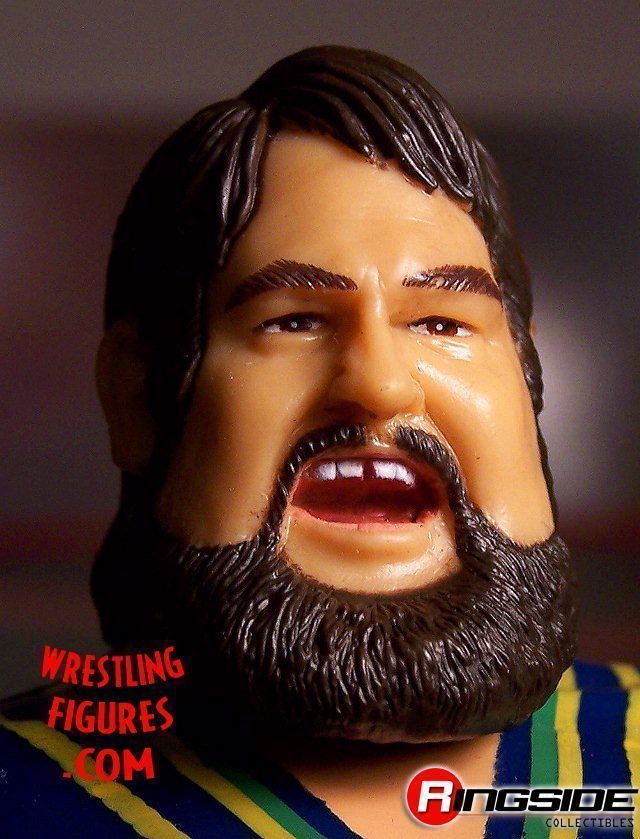
Kamala
I love this figure. Number one problem is his skirt being a lot more shorter than the prototype picture. Is this Kamala's new Gap miniskirt... for her? Other than that this figure is flat out awesome. The face is perfect in my opinion, the expression with the open mouth and the wide eyed look, the beard and the flawlessly detailed face paint. If the face paint is not 100% accurate, they've got me fooled.
The moon on the belly instantly reminds me of the Hasbro days and how bad that figure was action posed.
The mask was a very generous touch and is a nice reminder of the whole Kamala character at it's peak. Every younger fan needs to be educated on how to play with this figure....
He must try to pin the guy upsidedown a few times before he figures out that it's the other side. The ref would be pretty confused and his manager would be screaming as Kamala did play the part of uneducated and highly unpolished formal ring skills well.
By the way, for all you that are curious out there for whatever reason. He has on very short black tights under his patterned skirt. The skirt is pretty soft and has an authentic feel to it. I just wish it was a little longer
My rating for Kamala:
9.7/10 I only have issues with the skirt.
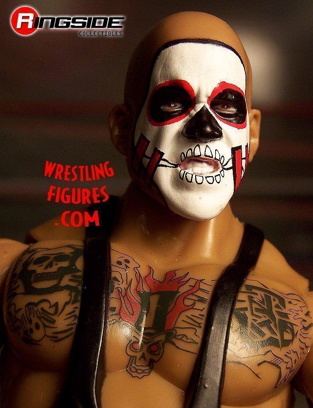
Bam Bam Bigelow
I started watching wrestling in 1991 so when I think of Bam Bam I think of Luna Vashon as well from about 1994. She would be a nice two pack with Bam Bam in another colored attire. She would be very interesting as a figure. Maybe Jeremy P. should do some research amoung the fans and see if she would be popular. I am not sure how people would feel about it but I would like to see it. But if it does happen, please remember she was very, very short and had shiney stockings (can you see my interest in detail on her figure now?). Her attires were off the wall.
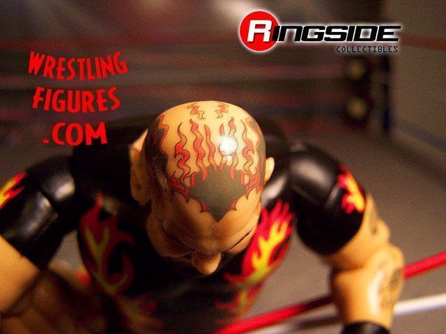
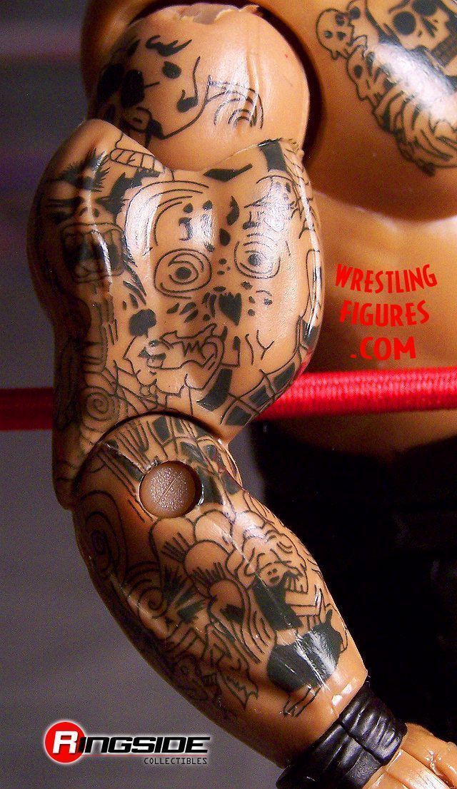
As for Bam Bam, the head is exactly how I pictured the final product would be. The missing tooth is a nice detail and the detail on the head tatoo is a sharp paint job. I am not sure that this tatoo is accurate though, I remember the front near what would be his widdow's peak being more colorful and overall I remember that tatoo covering more surface area on his head. I am not unhappy though, this Bam Bam is a Classic I hold just as high as any figure in my Classic collection.
This body mold in every aspect seems to just be the perfect fit for Bam Bam. I have no issues there except for the lack of painted designs on the back... I will mention our hard earned money being spent by our choice because we love these figures but are still not getting an all out job, one more time.
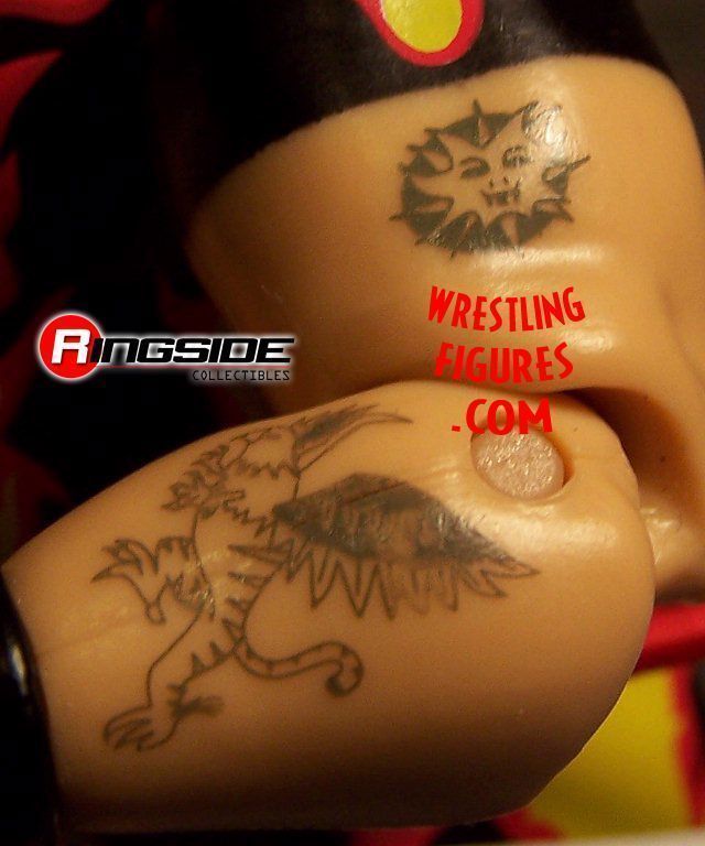
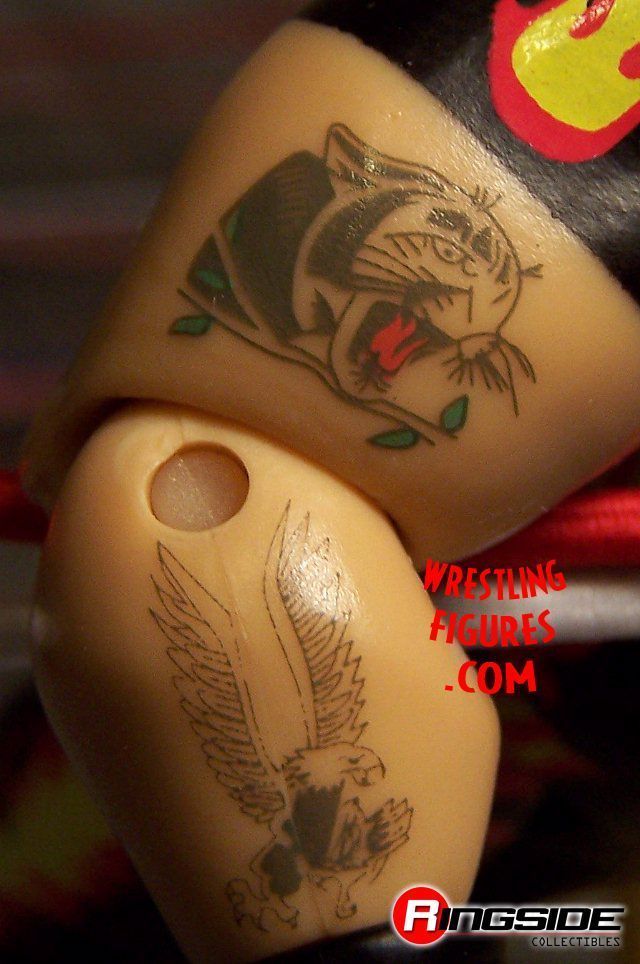
The tatoos on his arms are pretty detailed but seem a bit small. I like that they added just a small bit of red on his one arm tatoo, really brings a lot to it. Speaking of the red on his head and arm tatoos... I like that they are a slightly less saturated red, very realistic for a tatoo.
This figure along with Papa Shango are probably my two favorite from this set concerning debuts.
My rating for Bam Bam Bigelow:
8/10 No back designs... it's a 10 otherwise.
Akeem
Akeem was before my time. I missed him literally by a few months when I started watching wrestling. I just remember from footage that he was huge and this figure is a good reminder. It's very tall and the mass under his skin tight costume seems to be on point.
I like the change from the prototype from white to blue on his wrist bands, nice eye by Jakks on that one.
The only flaw I know about to the best of my knowledge is the missing outline of Africa on the back of his suit, that would have sealed the deal on the word glorious being used to describe this figure.
The new hair on this figure as opposed to the One Man Gang figure is very well sculpted. I am still amazed at the jobs Jakks does on creating heads for wrestlers who have passed away or are drastically different in appearance. The best one I have ever seen was Andre The Giant. It is something that can be thrown out there with ANY toys on the market and impress collectors knowing the artistic work that must have went into it.
Akeem came with a soft cloth hat that has stripes around the base. Once again a reminder how far these have come since the days of the smaller Hasbro figures. The hat was part of the mold on Akeem's Hasbro. There is nothing better about Classic Superstars for me than seeing an old Hasbro face on a Jakks product. It's such a trip back in time and something I honestly never thought I'd see.
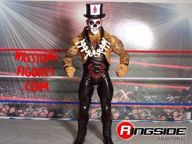
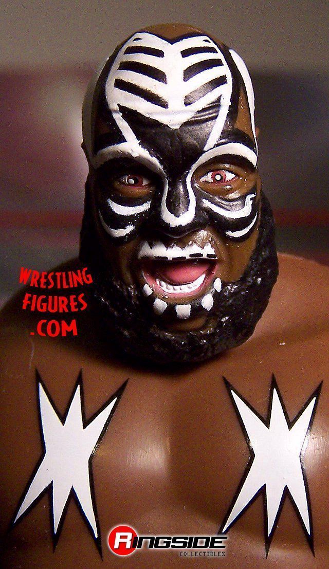
Papa Shango
The first thing that I noticed concerning reproducing his likeness is his posture. The torso used is the torso that debuted on Jim "The Anvil" Neidhart's CSTT1 figure. Most of us know that it is a torso that limits the verticle head positioning. For once I feel it adds to a figure. Shango's figure just appears to slouch slightly and further away from that point he also is a slightly more wide set than usual. The legs and torso base piece, better known as the crotch or pelvis piece, give him a wider set to compliment the thicker torso. These are some things that might be hard to notice from MOC pics of the final product. Considering Jakks did not use any new parts these were the best from the selection and they made a great, but obvious choice.
As for the actual singlet on the torso, I seem to remember Papa Shango's singlet not being one strap on his back and two that connected down near his lower back. Minor issue for some but a big issue for others. I really can't dwell on it much more than just acknowledging it so Jakks might possibly start using exclusive molds more often. Other toy series' use exclusive molds on every figure for every single part... I dream of a day Jakks does this for every WWE personality because it would add a lot more to them and I think it might affect the sales of shelf warmers.
Shango has a great head scan overall, the expression is perfect. The teeth and forehead show a fierce emotion. The eyes could be a bit better in my opinion. I wish there were more white on his eyeballs or we saw just a little more of his eyes... this is just a minor preference of mine and I realize not everyone will agree.
The tatoo's are very cool and for the most part do a nice job to the casual eye making you believe his entire arms are covered. I honestly am not sure if this guy has tatoo's on the insides of his arms but I imagine at least the insides of his forearms do.
Accessories include his black top hat which fits on his head but doesn't really stick on there. It's not going to fly off if you move the figure a little but you will not be able to turn him upside down, let alone on his side, without it falling off. Which is very life like for a sudden attack. The hat has a white painted square on the front with a painted on, small red feather. The prototype picture showed a realistic feather that was a seperate piece from the hat. Had I not seen the prototype picture this would have been fine with me and I am actually not even that bothered by it. I am just annoyed when prototype pics are changed in a result that lacks the same quality. It is not fair to the people who pre-order and also it's just another reason for the fans to complain. The painted on logo does the job but "the job" is also slightly tainted by memories of the high quality prototype pic feature.
His necklace is a soft rubber, black beeded and boned decorated piece that is a very nice extra but also reminds me of the extras that were left out. Shango used to wear some sort of cape/costume for his entrance and had a walking stick with a skull at the top. These are just mental image memories from my younger days but... Ric Flair has a robe right? Hogan has a velcro tear T-shirt with accurate rips in the back and above all mentioned the second CS Undertaker had a plastic cape... why not Shango as well? The fans pay a very high price for an action figure whether it is online or in a retail store. I believe in giving them the absolute best possible.
I also believe my pictures will do the rest of the explaining of the facts on the appearance of this figure.
My rating for Papa Shango:
8/10 I really think that's generous. The singlet is slightly off, the tatoos are not 100% perfect on covering everything, we didn't get the real feather, there is not entrance gear or staff. But, I still love this figure. I still recommend it based on the other great details.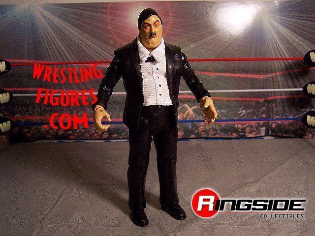
Paul Bearer
This one has some great spots but is a mess. My Paul Bearer figure is taller than Bam Bam Bigelow! If anybody in this set deserved an exclusive mold, it's this one. Check that, if anybody ever made deserved an exclusive mold, this one is right there with it. The figure comes with an urn and it does not fit in any of the hands without manipulation. The pants mold makes this figure extremely tall, RVD (who is too short) is up to his neck. The cloth shirt is garbage in my opinion. His collar looks more like a small towel that is draped around his neck and it hides the bowtie. Speaking of the bowtie... the prototype picture showed a traditional tie. To the best of my knowledge Paul Bearer never wore a bowtie and if he did, it was rare.
The biggest reasons why this figure just doesn't cut it for me in the end are:
1. The mentioned height
2. He is not fat enough
3. He is not pale enough in the face
4. The shirt is fake looking and doesn't show his belly popping out.
5. The urn will just have to sit next to him unless you want to stretch out his right hand or balance it in the left. He also can't hold it in both hands at once.
Bottom line when you think of Paul Bearer's likeness you think of a short, fat and creepy man. The final product for this figure threw most of that out the window.
Another thing... do we even have an Undertaker figure that can go next to this thing and look accurate? The Undertaker 3 pack possibly has some chances but I have not seen a Classic Undertaker figure that brings out his debut or shortly after into Classic immortality... and chances are he might be shorter than Paul Bearer.
I am very happy we now have a Paul Bearer and it is presentable to the casual fan. But for us regular collectors it must be leaving a void of some form. My biggest claim that I feel backs all of this negative ranting... cover Paul Bearer's head with something and look at just his body... is that Paul Bearer or Tony Chimmel? The head on this figure is the only thing that IS Paul Bearer. I think you get my point.
The head is wonderful though besides the tone. Honestly the tone is not really a huge issue, it is a very minor, but I would prefer him to have an appeal that makes you believe he is as white as paper. They did a GREAT job around the eyes though. The shading on his discolored and baggy eyes blends in realistically, in fact more cosmedically than it did sometimes in real life. The positioning of his eyebrow paint job adds a lot as well. The head has no major complaints from me and I am happy with it.
My ratings for Paul Bearer:
The head: 10 + The body: 0 avgs to: 5/10 Before you bash my rating, think realistically about what this could have been. Like I said I am happy he was made, he is worth considering buying but I will also not suck up to anyone and say you would be wise to hold out for a better... I'll take some heat from the powers at be to tell the truth.
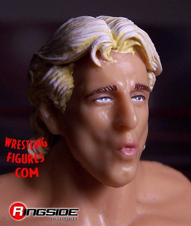

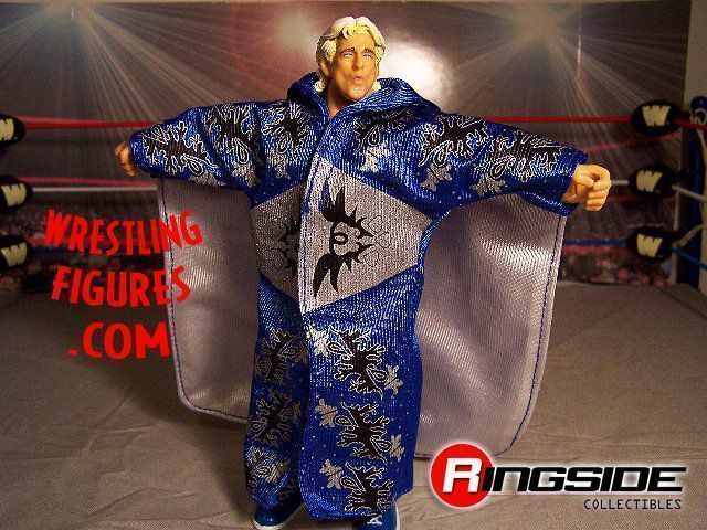
Ric Flair
Once again we have a figure that is altered from the prototype pictures in a way that makes me feel we were shafted. The head scan shown in the prototype pictures was a straight faced, shorter hair and debateably younger looking Ric Flair. This obviously is the head from CS2. When I saw the prototype picture which had that head and this attire I immediately thought of Ric Flair's old WCW Galoob figure. I'm not happy at all about the head change.
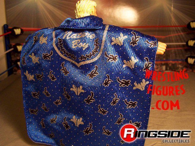
The robe is what I believe a new style for his action figures. It is very detailed and rather than go into a boring elaborate rant about each detail I will let the pics do the talking and comment about how I like the back of it having a tail.
Now for my problems:
1. The mentioned head switch
2. Wrist tape mold but Ric Flair doesn't wear wrist tape... at least it's not painted.
3. NO KNEE PADS. Come on, this is the Collectors Series and our left over black knee pads will not cut it on this one. Once again, the fans pay a remarkable price for these figures and a big detail like this is left out.
4. The belt he comes with is not even from the era of this figure. The belt he comes with is a title he never even held while it was that style. I honestly am stumped on this one, how is that possible when Jakks just created a larger style World Heavyweight belt that Ric Flair wore in his WCW days? Or the Winged Eagle belt, which we can always use an extra of. I realize this style Ric Flair might have worn other belts but I think once they changed the head scan it opened the possibilities on what era this figure is from.
CLICK HERE TO PURCHASE CLASSIC SUPERSTARS 9, IN STOCK NOW AT RINGSIDE COLLECTIBLES!